


Healthy Snacks On-The-Go
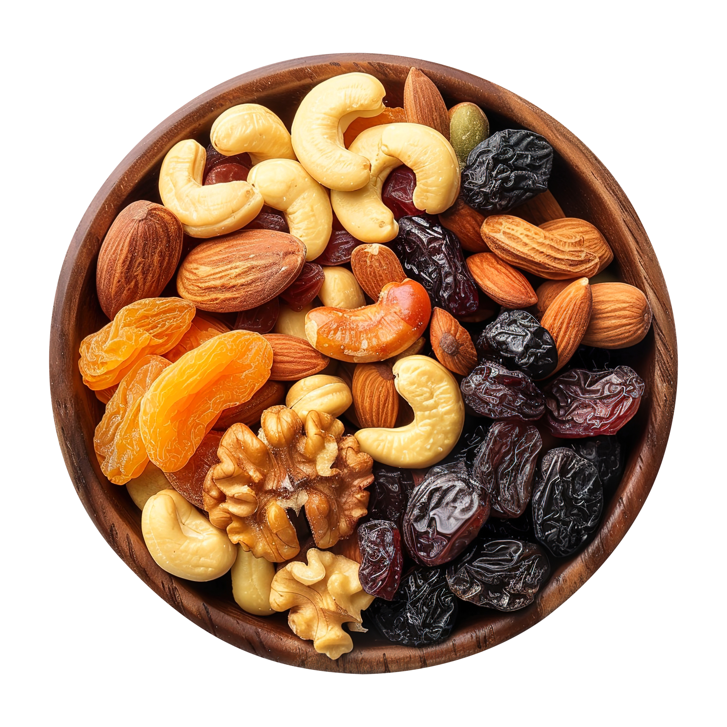
Premium Quality
SNACK
BOLD
SNACK
BETTER
Fuel your day with the crunch of wellness.
No guilt, just pure energy.
Boring Snacks?
Not on our watch.
The Challenge
Healthy food has a reputation for being bland, both in taste and branding. Nutkhat needed to shatter this stereotype. The goal was to build a brand that is loud, proud, and unapologetically energetic.
Archetypes
Jester
Playful & Fun
Explorer
Adventurous
Creator
Innovative
The Mission
To make healthy snacking quick, flavorful, and easy. Eliminating the trade-off.
The Vision
To become the go-to brand that seamlessly fits into everyday life. Smart snacking, effortless living.
Brand Identity
Foundation Colours
Amber
#ff9700
Warmth, Energy, Freshness
Indigo Purple
#553BB6
Depth, Stability, Confidence
Supporting Colours
Pine Green
#157457
Hot Pink
#F54478
Vivid Orange
#FF6328
Clean, Modern & Confident
After exploring multiple fonts, we found Ginora the most fitting. Its clean, modern structure feels premium and readable, staying silent yet showing power through its presence.
Ginora
Light
Light Oblique
Regular
Oblique
Semi Bold
Semi Bold Oblique
Bold
Bold Oblique
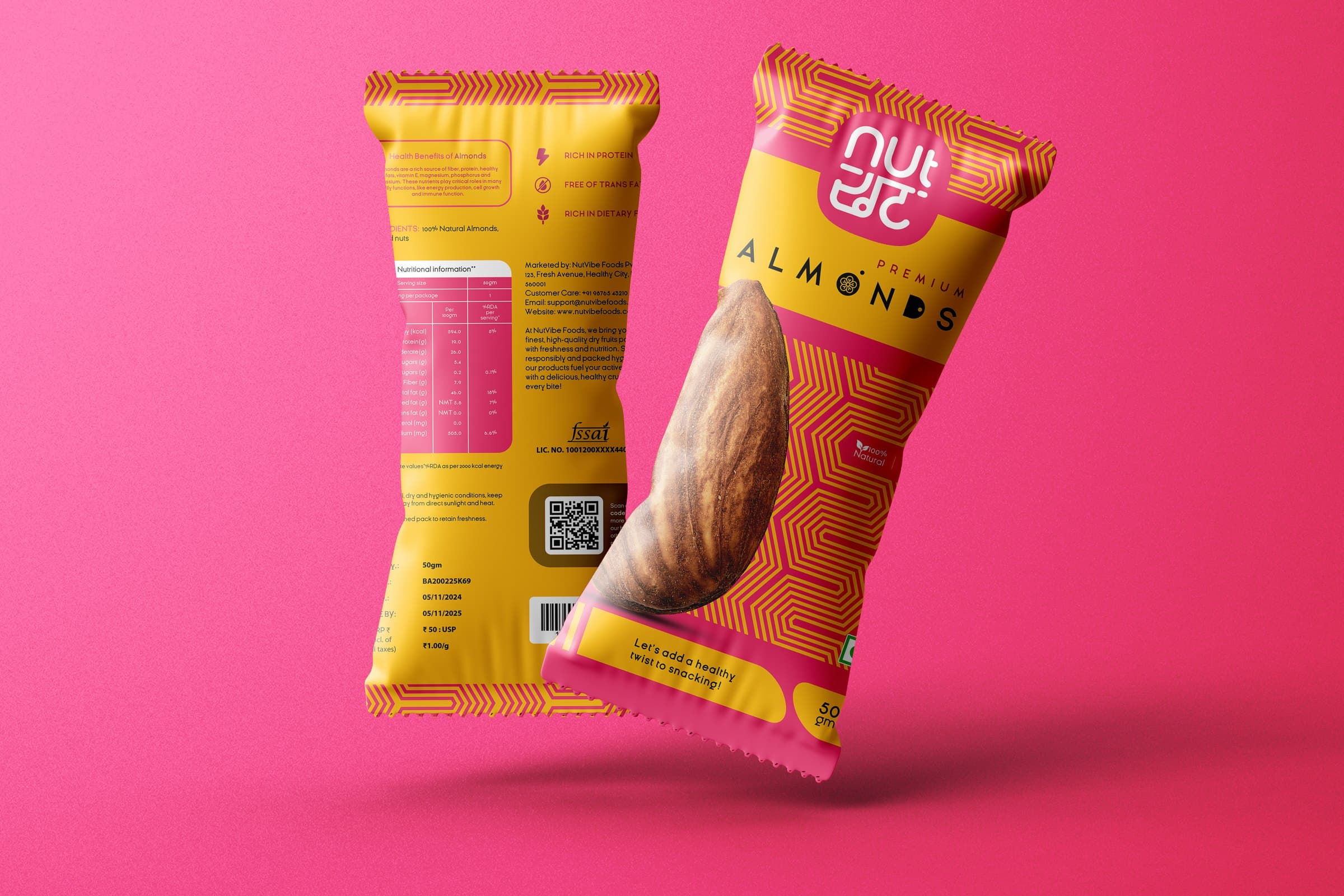
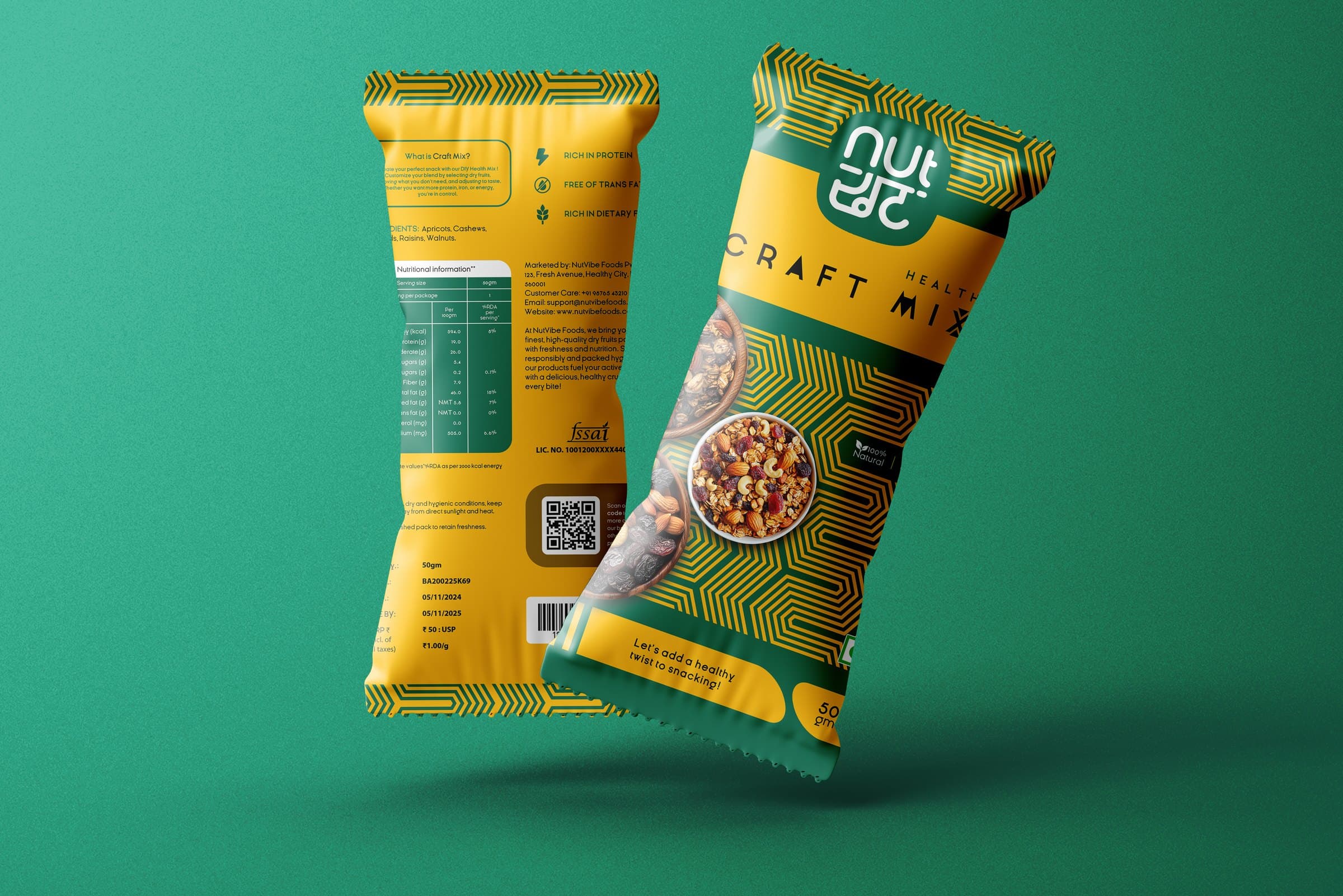
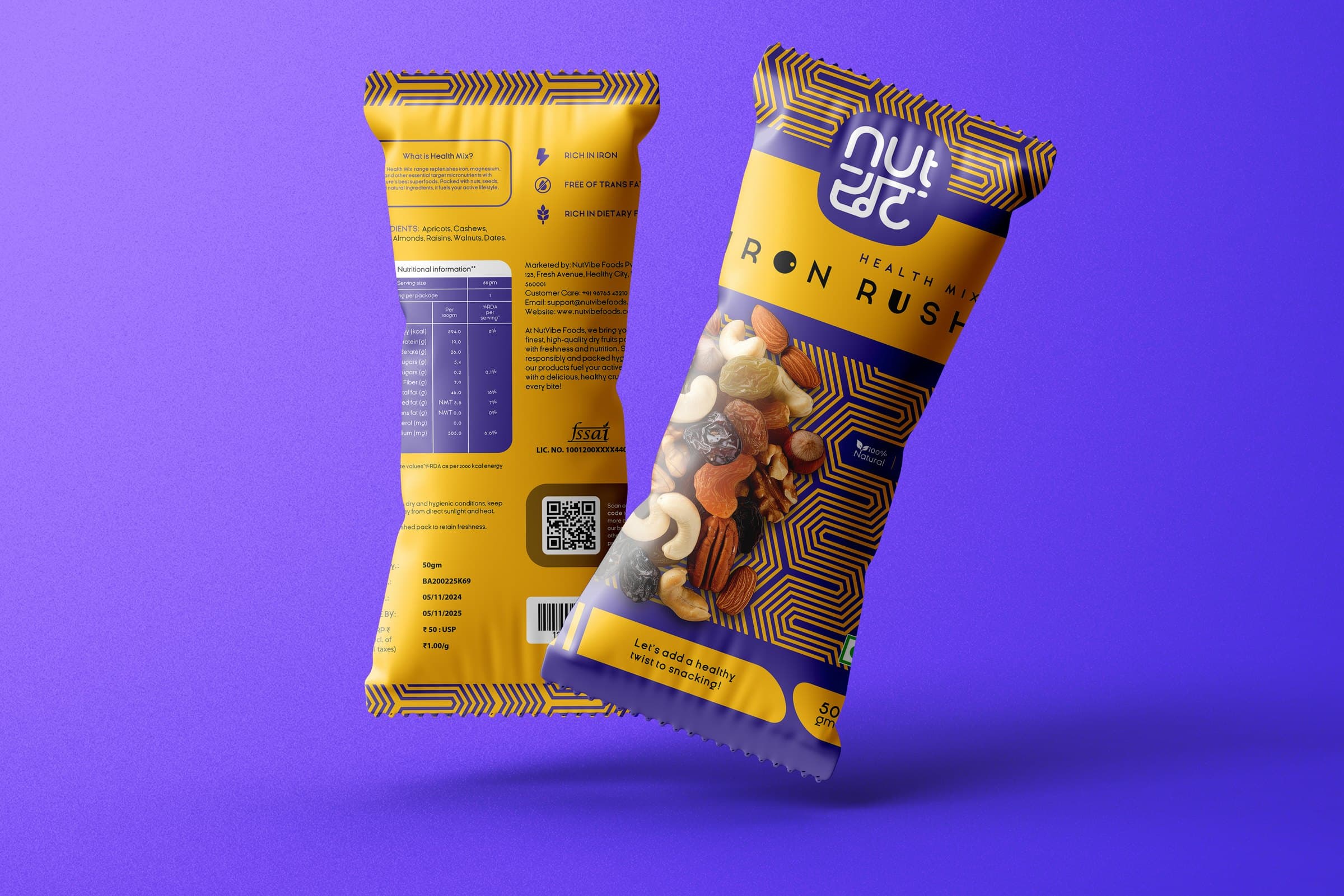
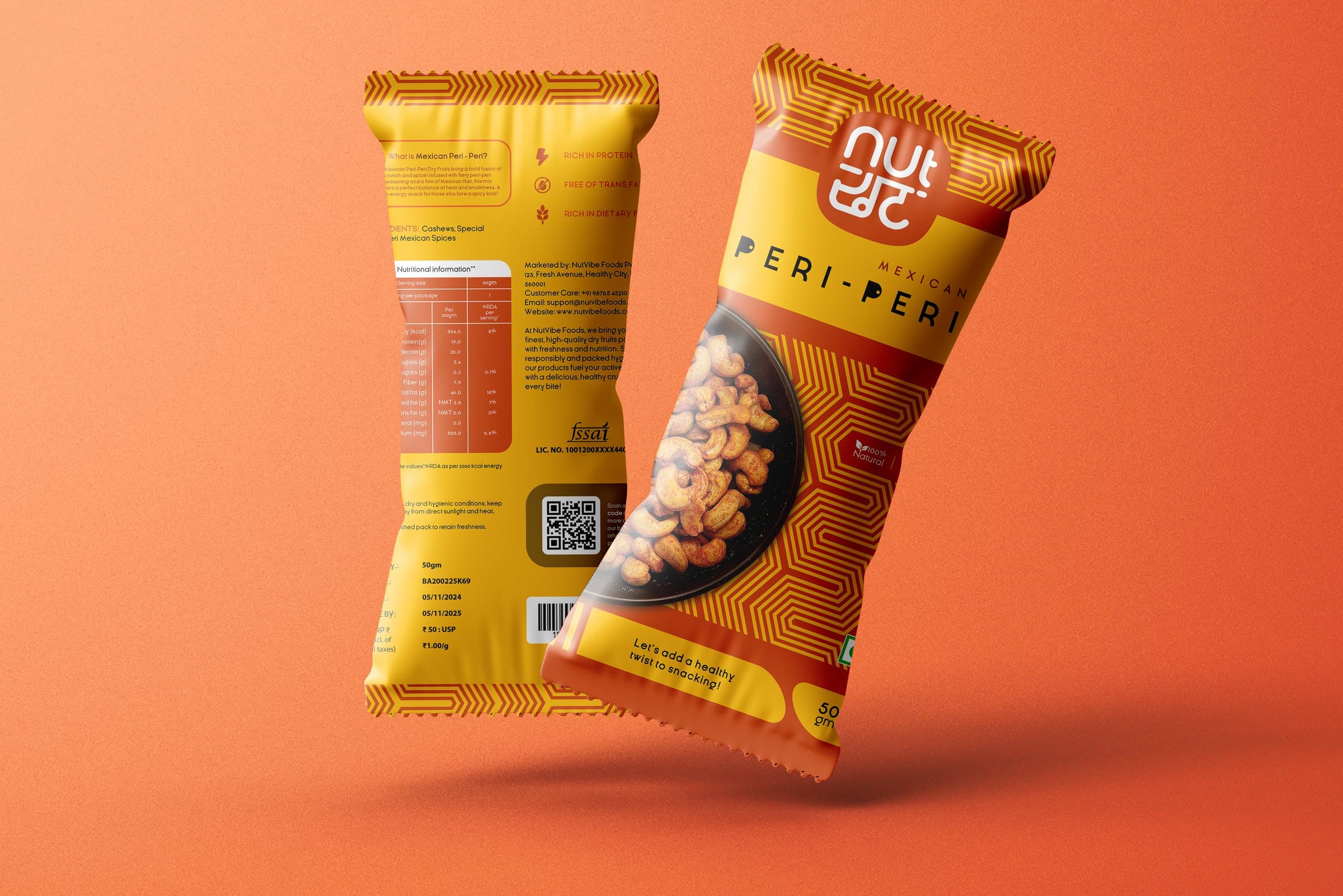
Packaging Series
Campaign Design
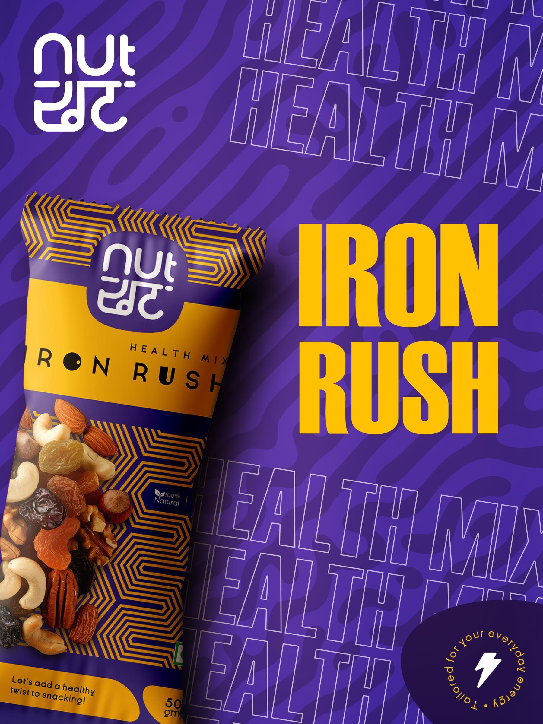
Iron Rush
A bold product-led post designed to instantly grab attention, communicate energy, and clearly position Iron Rush as a powerful everyday health snack.
The Full Range
This layout introduces the product lineup together, reinforcing variety while maintaining a strong, unified brand presence across flavors.
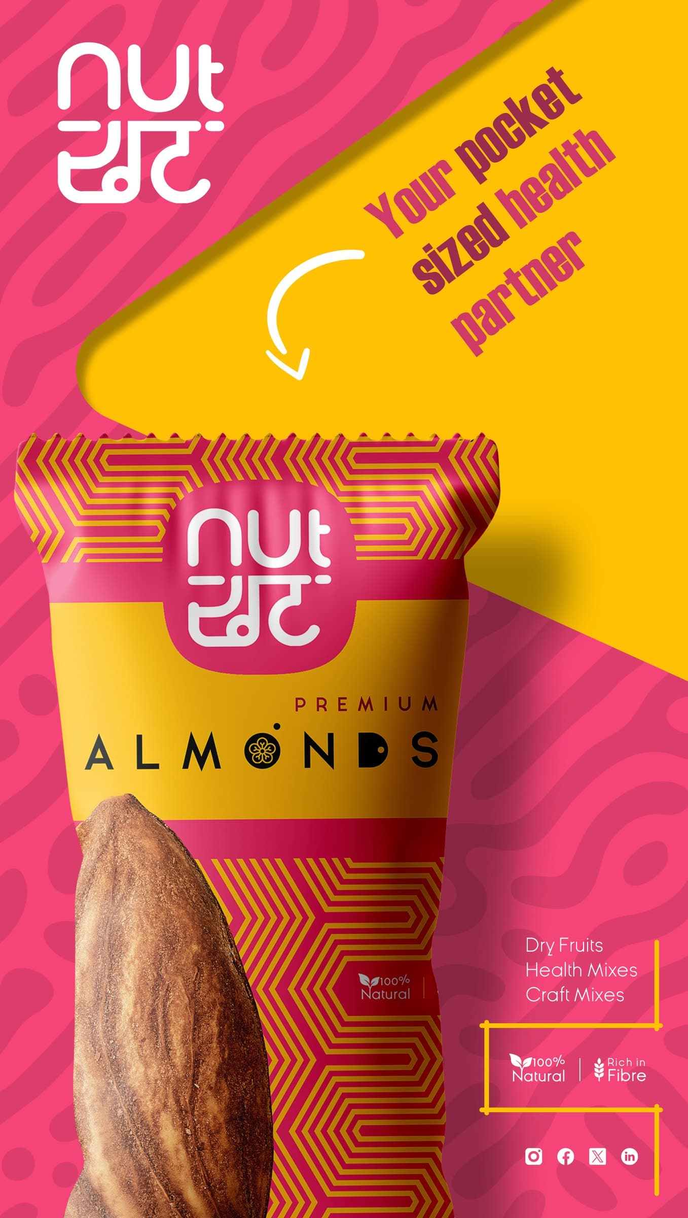
Stopping the
Scroll.
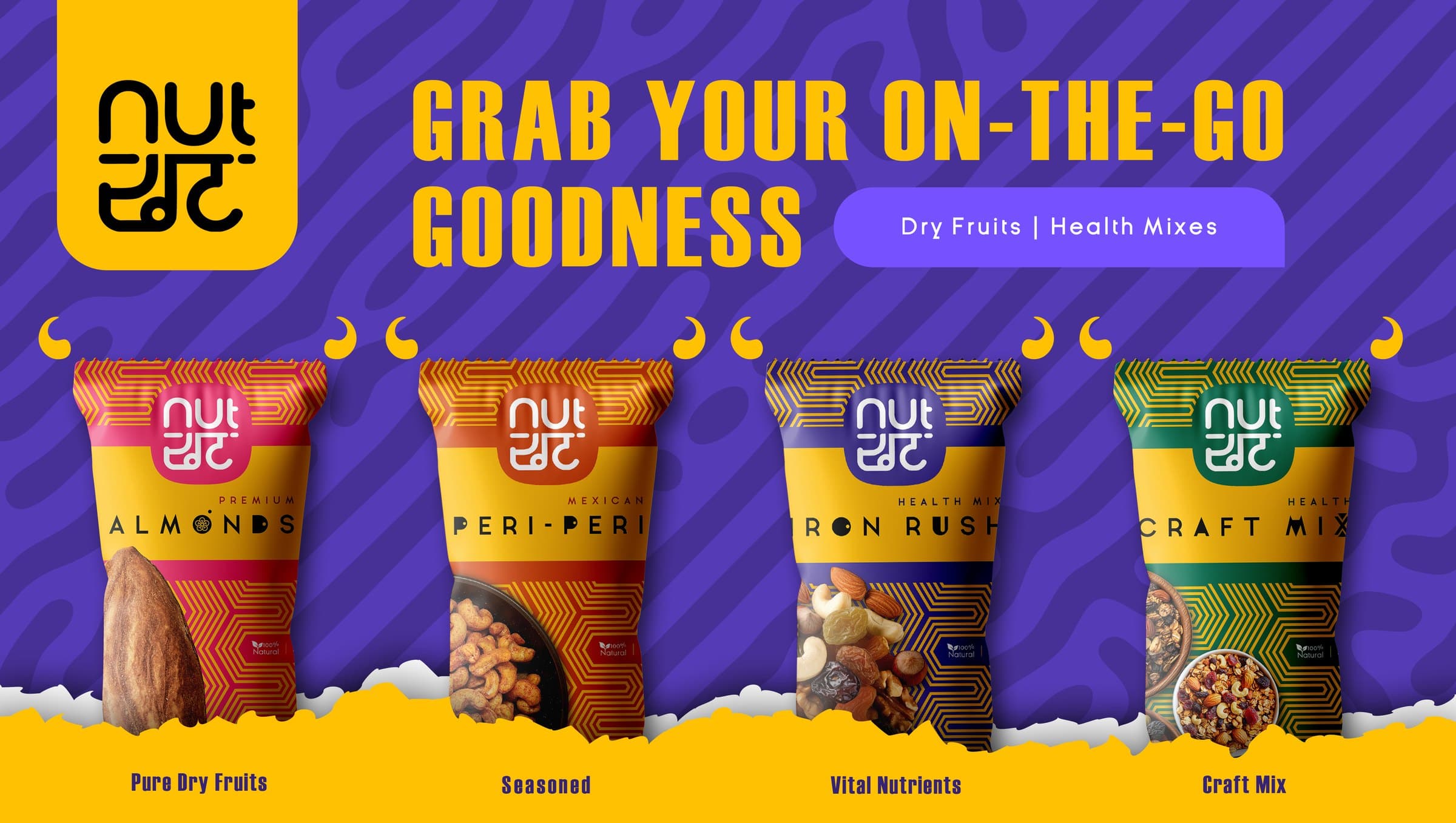
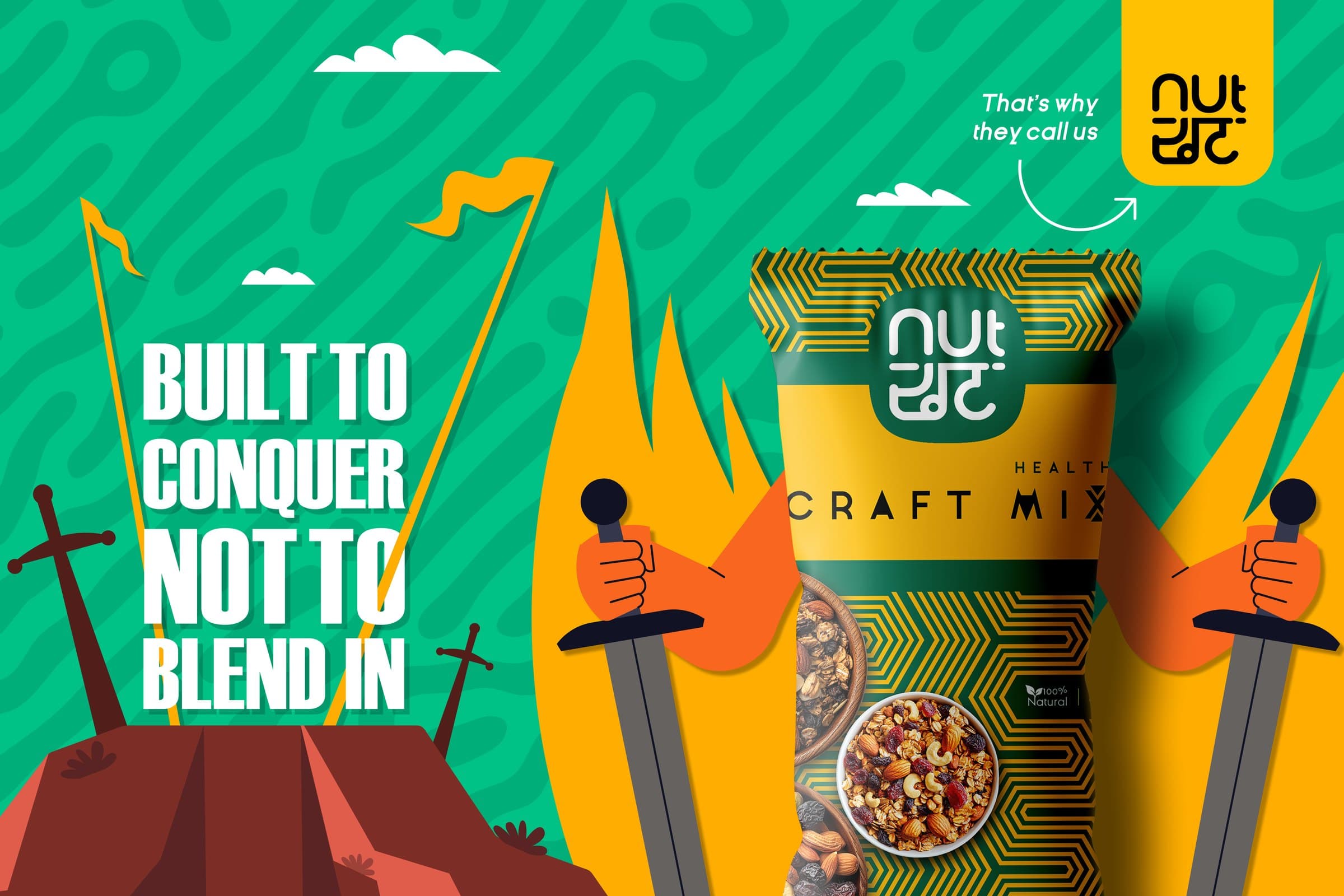
Outdoor Presence
High-impact visibility designed for large-format displays.
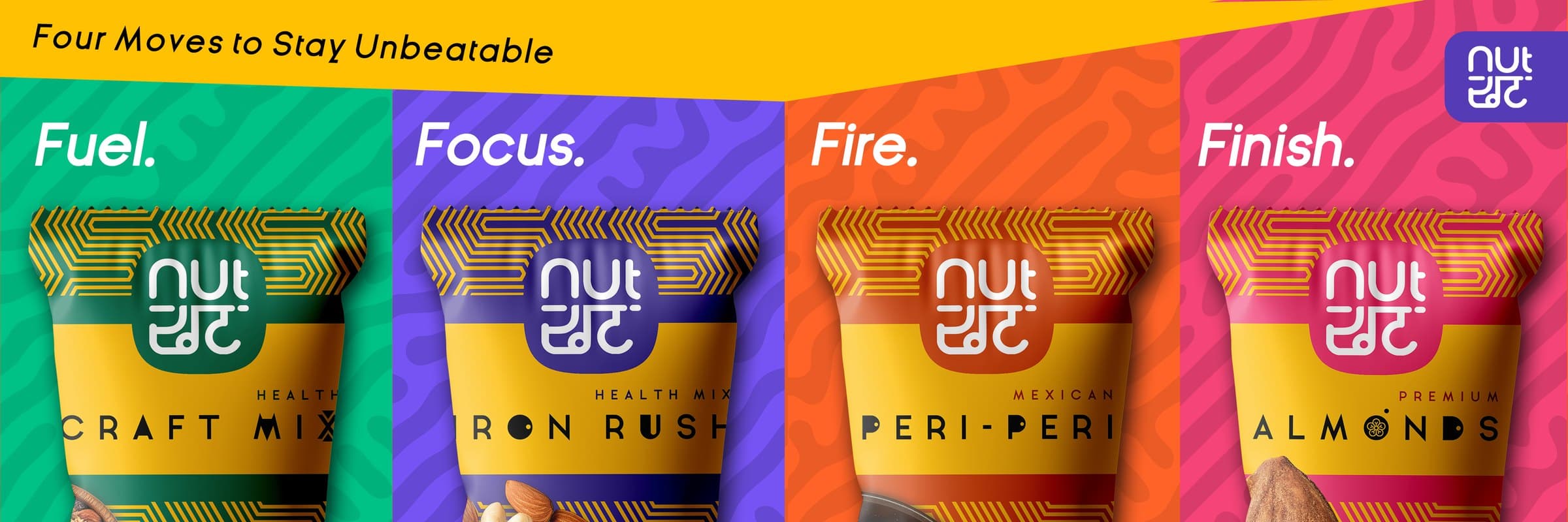
Project Scope
Strategy & Foundation
- Brand Strategy
- Brand Guidelines
- Visual Identity System
- Tone of Voice
Core Identity
- Logo Design
- Typography System
- Color Palette
- Pattern Design
Brand Application
- Packaging Design
- Social Media Assets
- Billboard & Outdoor
- Digital Marketing Assets
Ready to make
a splash?
Let’s build a brand that stands out on the shelf, disrupts the market, and stays in the mind.