


edXtra Brand
Guidelines
A reference guide for maintaining consistency and clarity across all edXtra brand touchpoints — digital, print, and beyond.
#0060FF
Bright Blue
#001E50
Deep Navy
#01163A
Darker Navy
#E8F1FF
Light Blue
#AACEFF
Sky Blue
#DED5FF
Lavender
#977DFF
Purple
#FFFFFF
White
#000000
Black
Logo System
The edXtra logo exists in multiple formats for use across different contexts and surfaces.
Mark
Pictorial Mark
The purest form of the edXtra identity. The flowing "e" and "x" merge into an infinite loop, symbolizing continuous growth, limitless learning, and the strong bond between education and technology.
Works best in small spaces — app icons, social profiles, watermarks, and merchandise where the symbol alone identifies the brand.

Stacked
Stacked Format
Icon sits above the brand name — balanced and formal. Ideal for documents, reports, certificates, and vertical layouts.
Black version — light backgrounds with subtle grey gradient for depth.
White version — dark backgrounds with soft grey gradient for visibility.

Horizontal
Horizontal Format
Icon beside the brand name in one line — clean and modern. The most versatile version, perfect for websites, email signatures, letterheads, signage, and banners.

Variants
Wordmark Color Variants
Three approved wordmark colors only — White #FFFFFF for dark backgrounds, Black #000000 for light, and Blue #001E50 as primary brand color.


Logo Construction
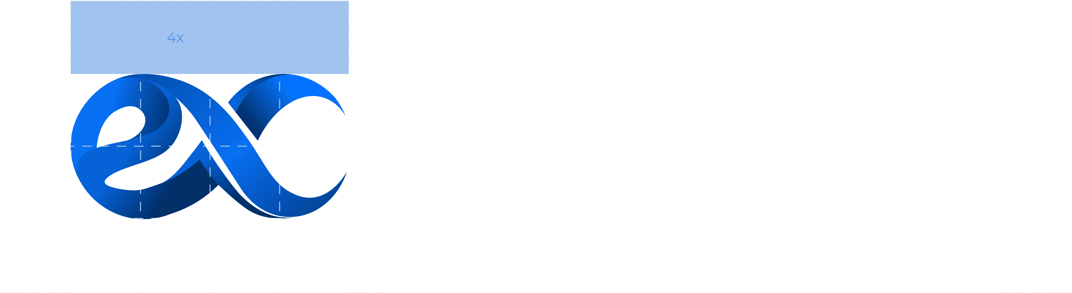
Precise grid system for consistent spacing, sizing, and alignment across all applications.
01
Construction Grid
- Structured on a modular grid where "X" is the base unit of measurement.
- Symbol spans 4X in width with additional margins for balance.
- Clear spacing of 2X maintained on all outer edges.
- Wordmark aligns horizontally with the symbol.

02
Clear Space
- Minimum clear space equal to 2X on all sides of the logo.
- No text, images, or graphic elements within this space.
- Ensures maximum legibility and prominence in every application.
03
Minimum Size & Scaling
- Print: Never smaller than 20mm width.
- Digital: Never below 100px width.
- Always resize proportionally — maintain the grid ratio.
- Do not stretch, skew, or compress.
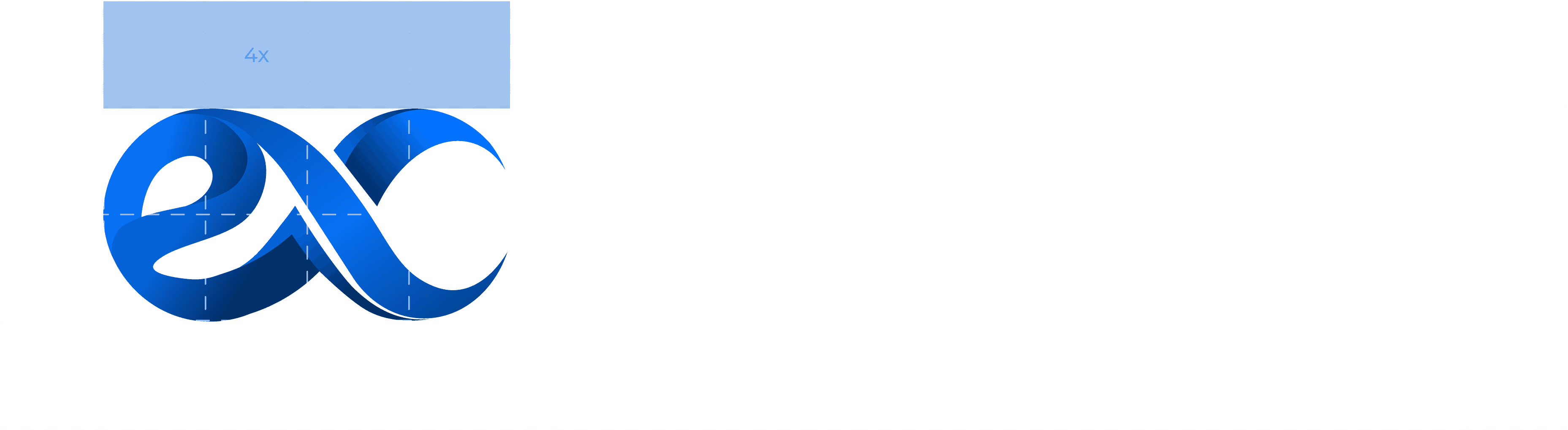
The edXtra logo is built on a precise grid system to maintain consistency, balance, and clarity across all applications. The proportional system ensures proper spacing and alignment every time.
Do's & Don'ts
Never place the logo on busy, textured, or low-contrast backgrounds. Always use plain or high-contrast areas to ensure clarity.
Don'ts

Don't Change Colour
Never alter the official brand colors

Don't Change Font
Never use different fonts for wordmark

Don't Rotate or Tilt
Keep the logo perfectly horizontal

Don't Stretch
Maintain original proportions always

Don't Crop
Show the complete logo at all times

Don't Strike Through
Never add lines or strikes through the logo
Correct Usage
If placement on an image is unavoidable, apply a solid color block, gradient overlay, or sufficient clear space behind the logo. Applies to all formats: full-color, black, white, gradient, and icon.
Montserrat
A modern geometric sans-serif — clean, versatile, and unmistakably edXtra.
Primary Typeface
Montserrat
Sans-Serif
Google Fonts
9 Weights
Character Set
A B C D E F G H I J K L M N O P Q R S T U V W X Y Z
a b c d e f g h i j k l m n o p q r s t u v w x y z
0 1 2 3 4 5 6 7 8 9 & . , : ; ! ? @ # $ % ( )
Education meets Technology
Empowering minds, enabling growth
Knowledge is accessible to everyone
Learning should feel natural and exciting for all
Why Montserrat?
Modern & Progressive
Reflects edXtra's focus on innovation and forward-looking education.
Versatile
Works in headings, body text, and digital interfaces equally well.
Approachable & Clear
Simple letterforms mirror the brand's mission to make learning easy.
Professional Yet Friendly
Balances authority with warmth — trustworthy and human.
01
Headlines
Bold or semi-bold weights to create impact.
02
Body Text
Regular or medium for comfortable reading.
03
Digital & Print
Optimized for web and print consistently.
04
Pairing
Montserrat remains the primary voice always.
Color Palette
Professionalism, innovation, and approachability — every color carefully chosen for brand consistency.
#0060FF
#001E50
#01163A
#E8F1FF
#AACEFF
#0C61D7
#DED5FF
#977DFF
#6D56CA
#F3F4F6
#9CA3AF
#374151
Bright Blue
CTAs, links, and interactive elements
Deep Navy
Trust, professionalism, and stability
Darker Navy
Headers, dark backgrounds, and emphasis
Light Blue
Soft backgrounds and highlights
Sky Blue
Accent and hover states
Medium Blue
Alternative CTAs and active states
Lavender Light
#DED5FF
Purple Medium
#977DFF
Purple Deep
#6D56CA
Light Gray
#F3F4F6
Medium Gray
#9CA3AF
Dark Gray
#374151
White
#FFFFFF
Black
#000000
Primary Usage
- —Deep Navy for headlines, primary text, and main UI
- —Bright Blue for CTAs, links, and interactive elements
- —Maintain 4.5:1 contrast ratio for accessibility
Secondary Usage
- —Accent colors for highlights, badges, and alerts
- —Limit to 10–20% of overall design composition
- —Pair with neutral backgrounds for maximum impact
Brand Patterns
Decorative backgrounds derived from core visual elements — reinforce brand identity across touchpoints.

Pattern 01
Half Hexagon Pattern
Concentric hexagonal outlines forming the "e" shape. Represents structure, precision, and forward movement.

Pattern 02
Infinity Loop Pattern
Flowing "ex" symbol — continuous learning, endless possibilities, and the eternal connection between education and technology.
Do
- ✓Use at low opacity to avoid overwhelming content
- ✓Combine both patterns in opposite corners for balance
- ✓Maintain consistent sizing across similar applications
- ✓Ensure patterns don't interfere with text legibility
Don't
- ✗Use patterns at full opacity
- ✗Place patterns over important content
- ✗Distort or skew the pattern shapes
- ✗Use patterns on busy or textured backgrounds
Product Mockups
Brand guidelines applied across touchpoints and marketing collateral.
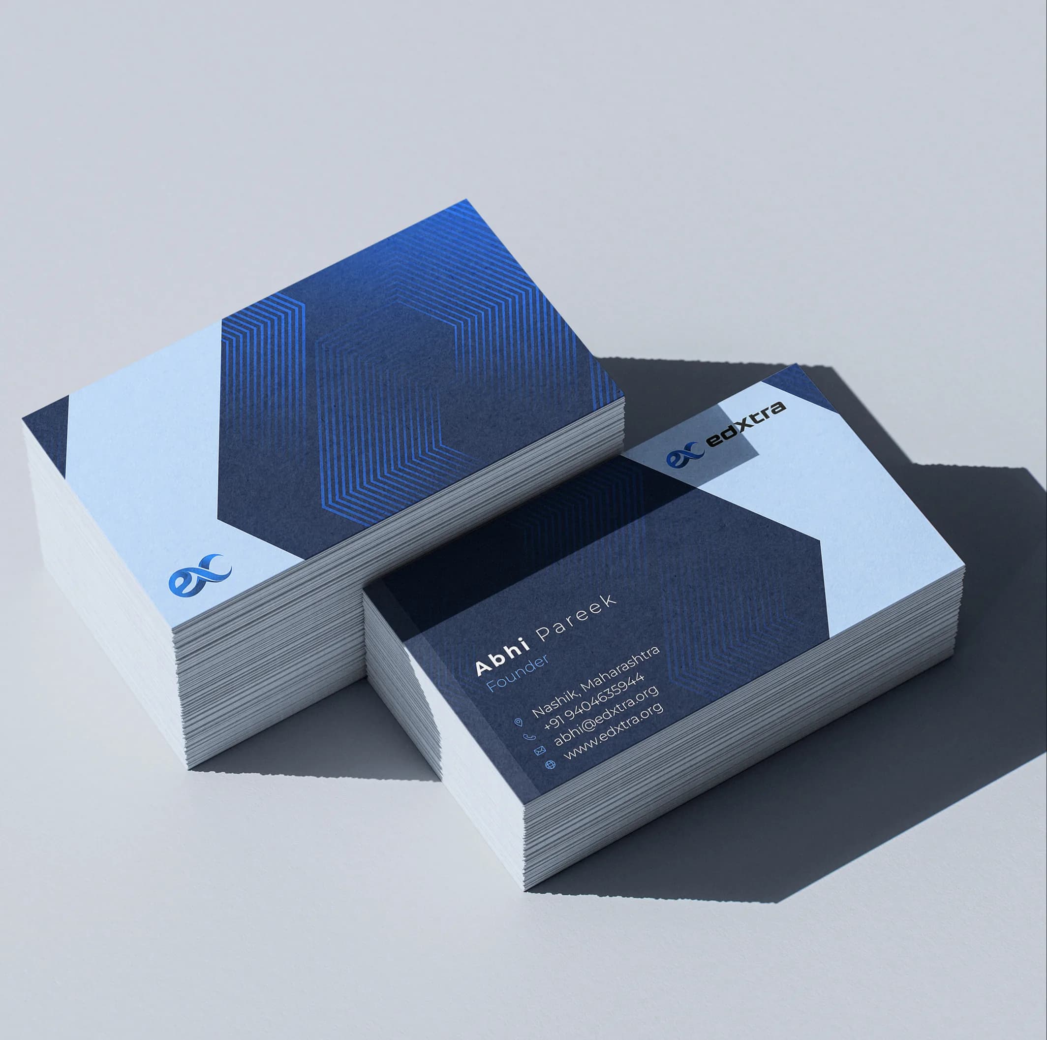
Business Cards
Brand identity on printed cards
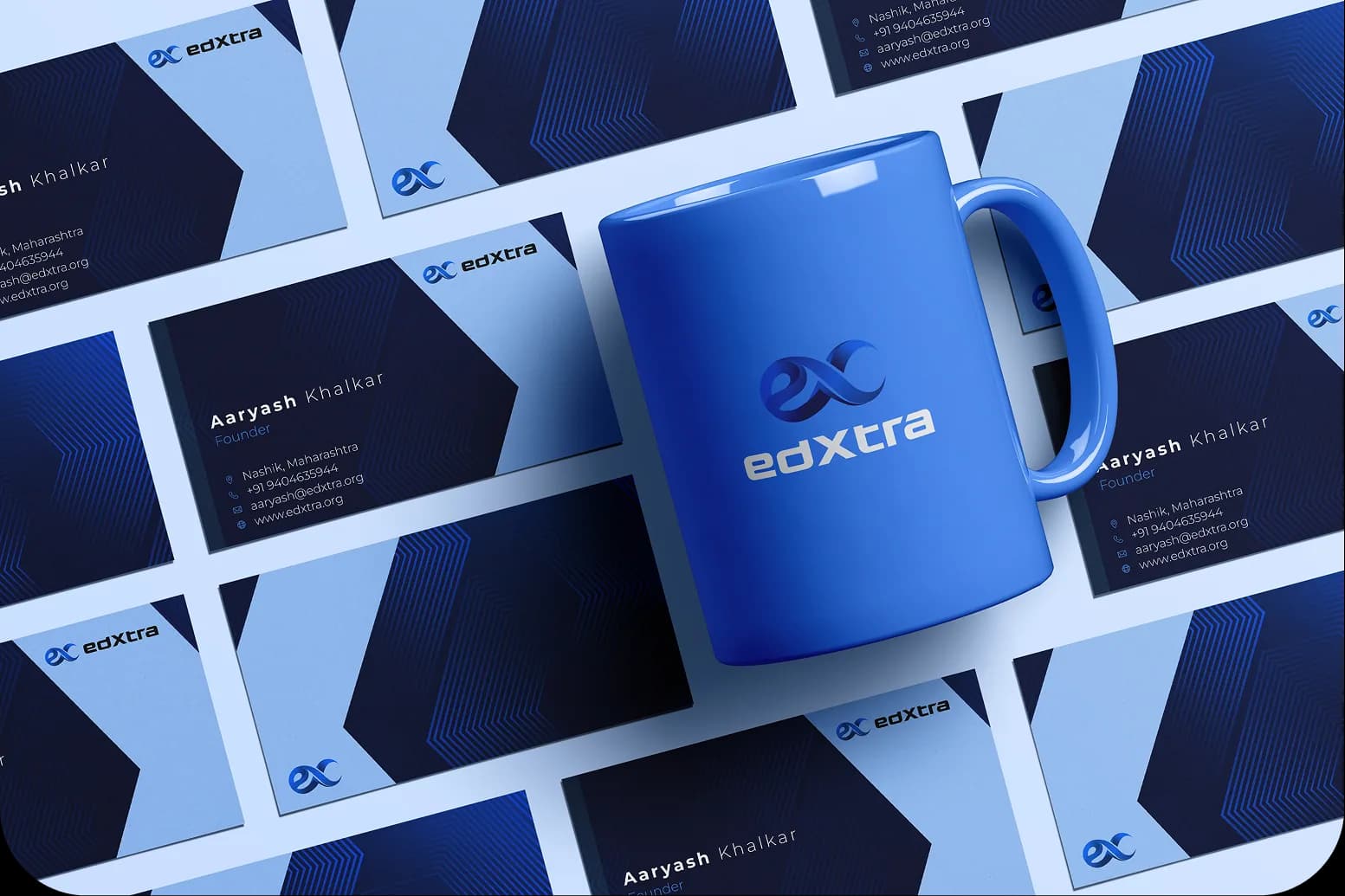
Mobile App
App interface and icon design
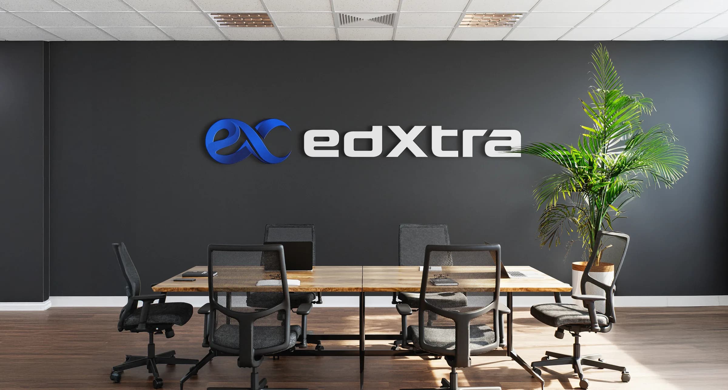
Email Signature
Professional email branding
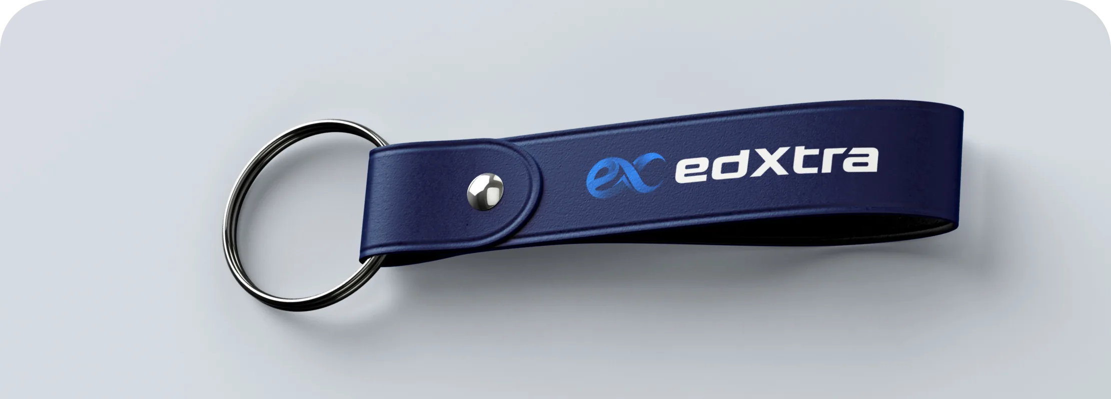
Keychain Branding
Branded accessories design
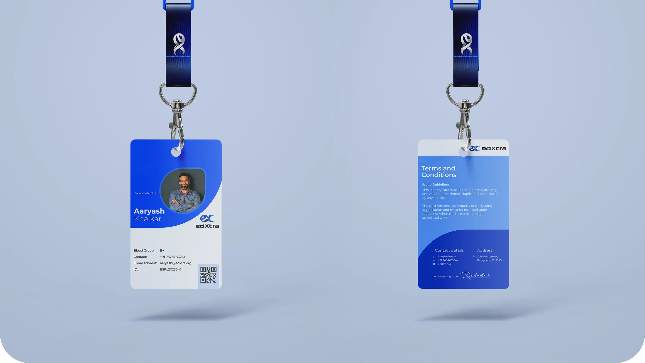
Employee ID Badges
Staff identification design

Ready to take the first step?
Get a custom quote, check your eligibility, or talk to a real expert today.